Turns out even with my crazy limited knowledge of photo editing and with only Pixlr for editing software I can still manage to put together an awesome Digipak in less than a day.
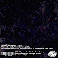
I created the image for the front and back covers by taking a weird static-looking frame from one of my shots from my filming and edited this in such a way that it looked bot industrial and a bit digital. I added noise and pixelated the image then adjusted it with the colour editing tools available on Pixlr. I actually really like the way they came out.
 Using made up names and the (real) company Warp Records I added all the necessary information that needs to go on the back of an album over the image that I had created for the front cover. I think that the similar covers are cool as it'd look as though the cover continues all the way around the back. The lack of focal point in the images is interesting also as it draws attention to the text without being completely lacking in detail; cool shapes and lines are visible in the image
My favourite panel of the design is the inside front cover. For the background image of this panel I used a still frame of the cloudy sky from one of my days of filming and edited it using tools such as Gaussian blur, Add noise, pixelate and many more. I again played with the colours until it looked perfect (to me, you may think otherwise). I then had to go onto paint to add the text in the font i liked as it is not available on Pixlr. The font I used was embarrassingly called 'MineCrafter 3' which I already had on my computer because I'm a bit of a Minecraft nerd. I came up with some names I thought sounded cool to go on there along with 'Transmission' the track for which I created the video.
Panel four the inside of the back cover wouldn't be attached on the seam nearest the fold (if it we're real) to create a sleeve for the disk itself to go in. For this panel I took a picture of Gracie which is actually already on the 10,000BC site and edited it on Pixlr until I was happy with it.
I really like the way all of the panels turned out, I feel they're all similar looking enough to be part of the same digipak and I feel they match the artist brand and the song really well.


No comments:
Post a Comment